Which typeface (or font if you prefer it that way – moogk explains the difference) is the easiest to read, especially by
less-accomplished readers?
I started this series of pages about font readability in 2004. I found I kept being told in a work context by those people who knew someone who was a world expert in these matters that such-and-such as font had to be used because it was the most readable, so I looked into it a bit.
And I thought, that’s fun, the world expert must be on shaky ground, so I began to put my researches onto my blog, to keep the thoughts in order as much as anything else.
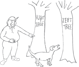
The answer is, my researches have uncovered, that the question itself is, for various reasons, barking up the wrong tree.
If you are given a choice, then it does seem to be a natural human need to want to know which, among the choices you are given, is the best choice to make. This despite the experience that in many things, there is no absolute perfect choice. If you look in the cake shop window, you will not want to choose the same thing always, now, will you? At breakfast you might like a croissant and in the afternoon a cream cake. Everyone knows that don’t they? Do they?
And different fonts are used for different reasons; even if there was one that turned out by some magic to be ‘easier to read’ (whatever that means) than others, to use it all the time and everywhere would make life dull, tedious, utilitarian and poor.
Look at a newspaper. One aimed at the less erudite readership. What font do they use? Well of course they don't use a single font, they break up the page with variety. A singe font would make the page heavy and turgid.
Next, roll the newspaper into a tube, and whack those experts over the head with it.
I come at this not as a typographer but as an observer of human nature, and fonts seem have gripped the human imagination. I suspect the reasons have a lot to do with the desktop pc, and a wish to master its perceived intricacies. There must be an answer, is the wish of many.
I blame the education system (in most countries) that still seems to instill in people the idea that there is an answer to anything. It’s time that changed.
These pages discuss some of the things that you may be able to use as some form of evidence with those who are perched on their bar stool determining what is or should be. I hope you are lucky in liquidising the fixed view a bit; it will certainly be an uphill struggle. I keep thinking I’ll take these pages down, because typefaces aren’t really my subject, but then so many people from all over the world keep asking, what is the easiest font to read? that I kind of think it would be a shame to.
If someone says to you, ‘It’s been categorically proved that such-and-such a font is the
easiest for people to read’, the first thing to ask yourself is whether it is a Microsoft font they are proposing
and then consider Microsoft’s forgotten monopoly . Though whether the favourite font is from Microsoft or not, to think that we have recently discovered the typeface of universal optimum readability is, er, rather arrogant, or let’s be kind, innocent.
Typefaces in the sense that we know them have been around for something in the region of 550 years. For those who actually want to learn about using type, try for a startoff: 50 Totally Free Lessons in Graphic Design Theory by Danny Outlaw. See also The Typographer as Reader, by Will Hill on the Linotype Font Lounge. OK, some of that is a bit complicated and a lot to take in in one go. Just remember: varied blocks; not too dense; lots of air; line spacing. Don’t worry too much about which font.
And to rub in the point alluded to in the previous paragraph: t’aint what ya do it’s the way how’s ya do it! Which is obvious really isn’t it? The perfect font for readability (we’ll call it Ay Carumba!), set too close together, would give you a perfect headache. You know that.
Books have been written on how to lay out type,
one of the best-regarded being The Elements of Typographic Style by Robert Bringhurst, about which, in relation to web pages in particular see The Elements of Typographic Style Applied to the Web. That book and others like it will not tell you which is the best font to use, it’ll give you guidelines on how to lay out a page. There’s a web page discussing the issue of layout for readability (not fonts note, but layout) at The 100% Easy-2-Read Standard.
And now for something really sensible
If you have read my Typoface pages, you should surely by now have come to believe that there is no such thing as a ‘best’ typeface. And to prove it to your boss, who probably knows for sure that there is, you can show him or her the demonstration of typestyle in relation to fashions in clothing, that you can find at www.linotype.com/2258-16895/fashionandtypeface.html.
And further reading about legibility? You can’t do better than this: www.linotype.com/ 2258-16905/ aboutlegibility.html
And in colour?
There’s also the issue of readability of different colours of text on different hues and shades of background. This complicates the subject rather, and I’m in the process of building up some pages on this. You can make a start with Readable Text in Colour, which gives some thoughts as well as some Javascript, and with my text colour readability page and you can accompany this with experiments using TypeTester.
Essentially, when looking at colour readability, the hue (eg red, green, blue etc) is of minimal importance; far more important for readability is the relative brightness of text against background. That is to say, that red on green is perfectly readable (despite what your teacher said) provided it’s a light red against a dark green or vice-versa. You really should see my text colour readability page. Have fun!
Next page in this set: Arial v Comic Sans.


